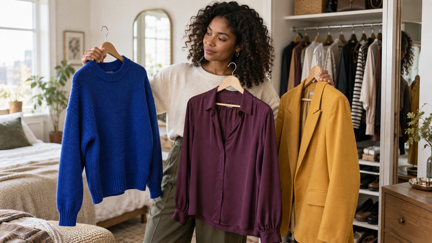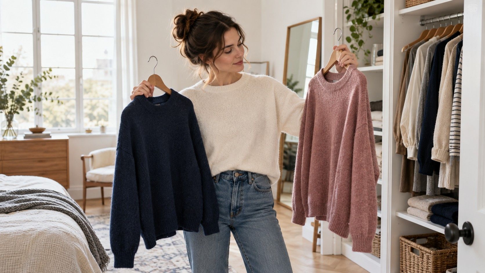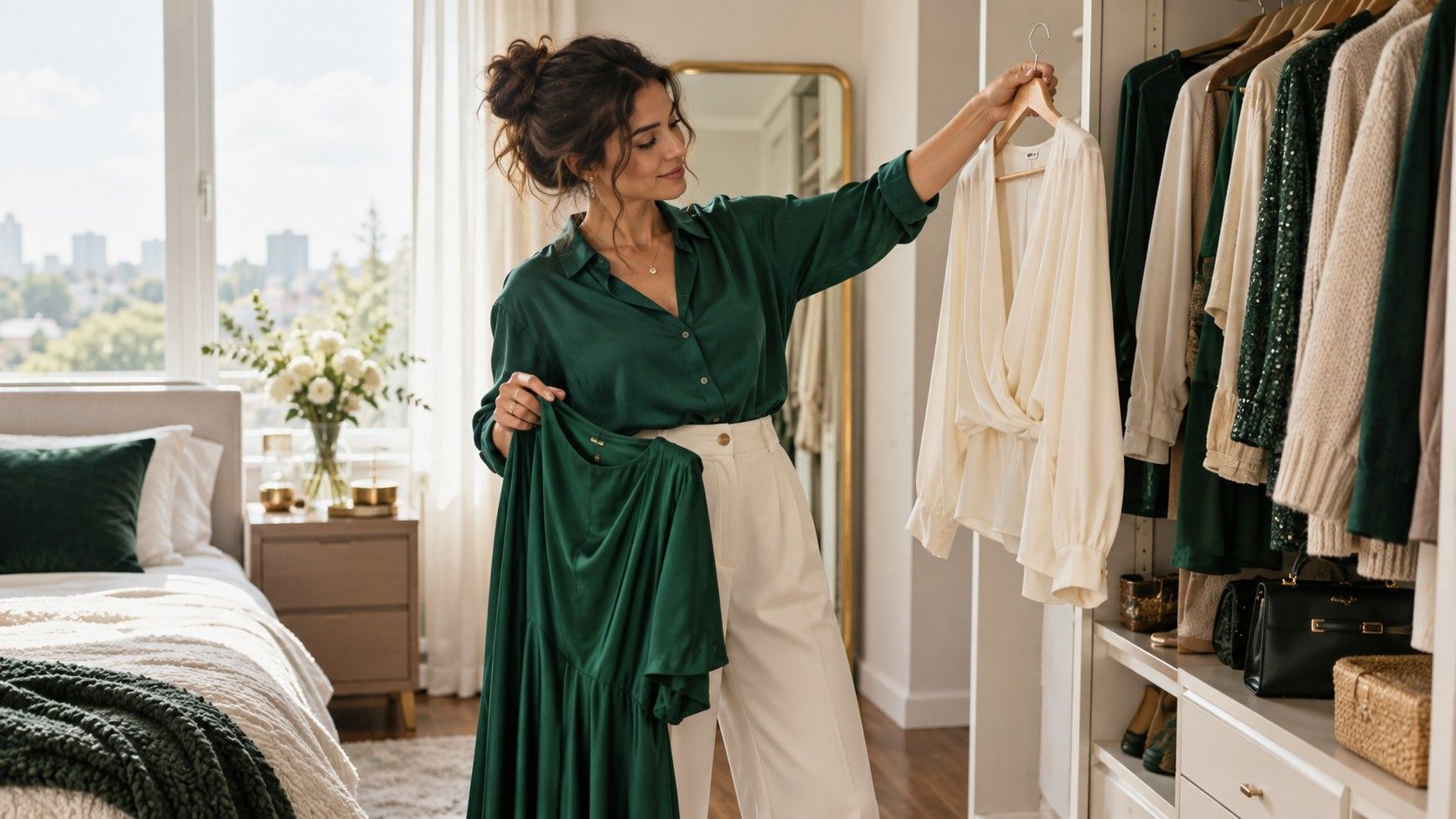
Skin that looks yellow, golden, olive, or warm in a mirror does not need to be corrected with clothing. The useful goal is definition: choosing colors that let the face look present rather than letting a garment turn it dull, overly sallow, or strangely red. Yellow skin tone colors to wear are best chosen through comparison, because surface color, undertone, lighting, and contrast can all pull in different directions. A warm palette is a helpful starting point, not a verdict that removes every cool shade from the wardrobe.
Separate a yellow surface tone from the color beneath it
Surface color changes. A little sun, a red patch around the nose, tiredness, or a foundation mismatch can alter what you see from one week to the next. Undertone is the steadier color cast beneath the surface, though even that is not always obvious. Skin with yellow undertones may look golden, beige, olive, or neutral-warm; none of those descriptions tells you a person's background or health, and none needs to become an identity category.
Use clothing comparisons instead of trying to decode skin alone. Stand in daylight with a warm white tee and a crisp blue-white tee. Then compare olive green with a cold mint, or terracotta with raspberry. Notice which option gives the eyes and mouth more definition. If warm white and olive make the face look composed while blue-white and icy pink feel separate, you probably have useful evidence for a warmer direction. If the result is mixed, keep both groups in play and test brightness next.
Choose colors that create definition, not extra yellow
The common mistake is assuming that yellow-leaning skin should wear every yellow garment available. Strong yellow beside a golden face can sometimes look energetic, but it can also flatten the contrast until the whole outfit becomes one note. Colors that sit a little away from the skin often work better: emerald, deep teal, rust, brick red, warm navy, aubergine, chocolate, and olive. They give the complexion an edge without fighting it.
For clothing colors for yellow skin tone female searches, the most repeatable choices are usually medium or deep versions first. A rich forest green sweater has more structure than a pale acid green one. A rust dress can feel warmer and more grounded than bright orange. Deep teal has enough blue to balance gold undertones without producing the chilly effect of an icy aqua. This is also why fit and fabric matter: a good olive in crisp cotton can look entirely different from the same olive in shiny satin.
Make yellow, gold, and warm neutrals work on purpose
Yellow and gold can be beautiful when they have the right depth. Mustard, marigold, ochre, saffron, and muted gold tend to have enough earthiness to stand apart from warm skin. Pale lemon and highlighter yellow are less forgiving because they bring a lot of light and little depth. Hold the garment under the chin rather than judging it across a room. If you see the top before you see your face, move it lower in the outfit or choose a darker version.
Warm neutrals are the practical part of a color palette for yellow undertones. Golden beige, cream, camel, tobacco brown, warm gray, mushroom, and chocolate can form a useful base, but avoid collecting them at the same value. Cream knit, camel trouser, and tan shoe may blur into one long field unless you add a dark brown belt or emerald layer. White deserves a comparison too: warm white, ecru, and cream often feel gentler than optical white, especially in a large shirt or coat collar.
| Color group | Useful shades to try | Practical adjustment |
|---|---|---|
| Greens and blues | Emerald, forest, teal, warm navy | Use them near the face when warm tones feel too close |
| Reds and oranges | Brick, rust, tomato, cinnamon | Choose depth over fluorescent orange |
| Yellows | Mustard, ochre, marigold, muted gold | Pair with brown, navy, or emerald for contrast |
| Neutrals | Cream, golden beige, camel, chocolate | Mix light and dark values rather than stacking beige |
Use blue and green when a warm outfit feels too close
Balancing colors are not about cancelling the skin; they give warm coloring a clean frame. Emerald is particularly useful because it is saturated, elegant, and far enough from yellow to create definition. Teal can do the same job in a softer way, while warm navy is a dependable substitute for black in denim, tailoring, and outerwear. These shades are helpful when a tan, rust, or mustard piece is beautiful on its own but makes the face look a little too monochrome.
Try a simple switch at the neckline. If a golden-beige blouse feels flat, add a deep teal cardigan rather than abandoning beige entirely. If an olive jacket looks heavy, place a warm-white T-shirt beneath it. Blue can be a balance without being ice-cold: denim, peacock teal, and ink navy carry enough depth to work with gold jewelry, camel leather, or warm brown shoes.
Work with olive tones without reducing everything to olive
Olive is often described as though it were an undertone by itself. In clothing, olive is simply a family of greens with yellow, brown, or gray mixed in, and it can be excellent for skin that reads warm or yellow. The better olive shades usually have enough depth: army olive, moss, eucalyptus, and deep khaki are easier to style than a very pale yellow-green. Pair them with cream, chocolate, denim, rust, or burgundy so the outfit has a clear structure.
Be careful with olive-on-olive. A jacket, top, and trouser all in slightly different olives can look intentional in a well-cut suit, but in casual separates it can become murky fast. Break it with a lighter warm neutral or a dark contrast. Also remember that an olive garment can be useful below the waist even if it is not your best near-face color. Trousers and skirts give you more freedom than a turtleneck does.
Test your existing wardrobe before shopping for a palette
Lay out your most-worn clothes and group them by color. You may discover that your reliable pieces are already telling a coherent story: dark denim, cream, olive, chocolate, deep teal, and rust. Then identify the items that are admired on hangers but avoided in the morning. They may be too pale, too bright, too similar to your skin, or simply awkward with everything else. The answer is often more specific than “this color is wrong.”
Make three outfits from the pieces that work and photograph them by a window. One can be mostly warm, one can use emerald or navy as the lead color, and one can mix cream with a deeper accent. Check the photos later, when you are not standing under shop lights. The colors that still make your face look defined and that combine with your everyday shoes and coats deserve more space in the wardrobe.
Keep the palette useful in real life
A practical warm-leaning wardrobe does not require a new shopping list. Choose two or three neutrals you enjoy wearing, add several colors with depth, and repeat them enough that outfits come together without a puzzle. Cream, chocolate, dark denim, olive, emerald, rust, and warm navy make a generous starting group. From there, add a floral print or scarf only if it connects at least two existing colors.
The best yellow skin tone colors to wear are the ones that make mornings easier and leave room for personal taste. If mustard makes you happy but only works below the waist, wear mustard trousers. If emerald always makes your eyes look clearer, let it become a signature knit or dress. A palette should offer useful choices, not persuade you that your face needs fixing.