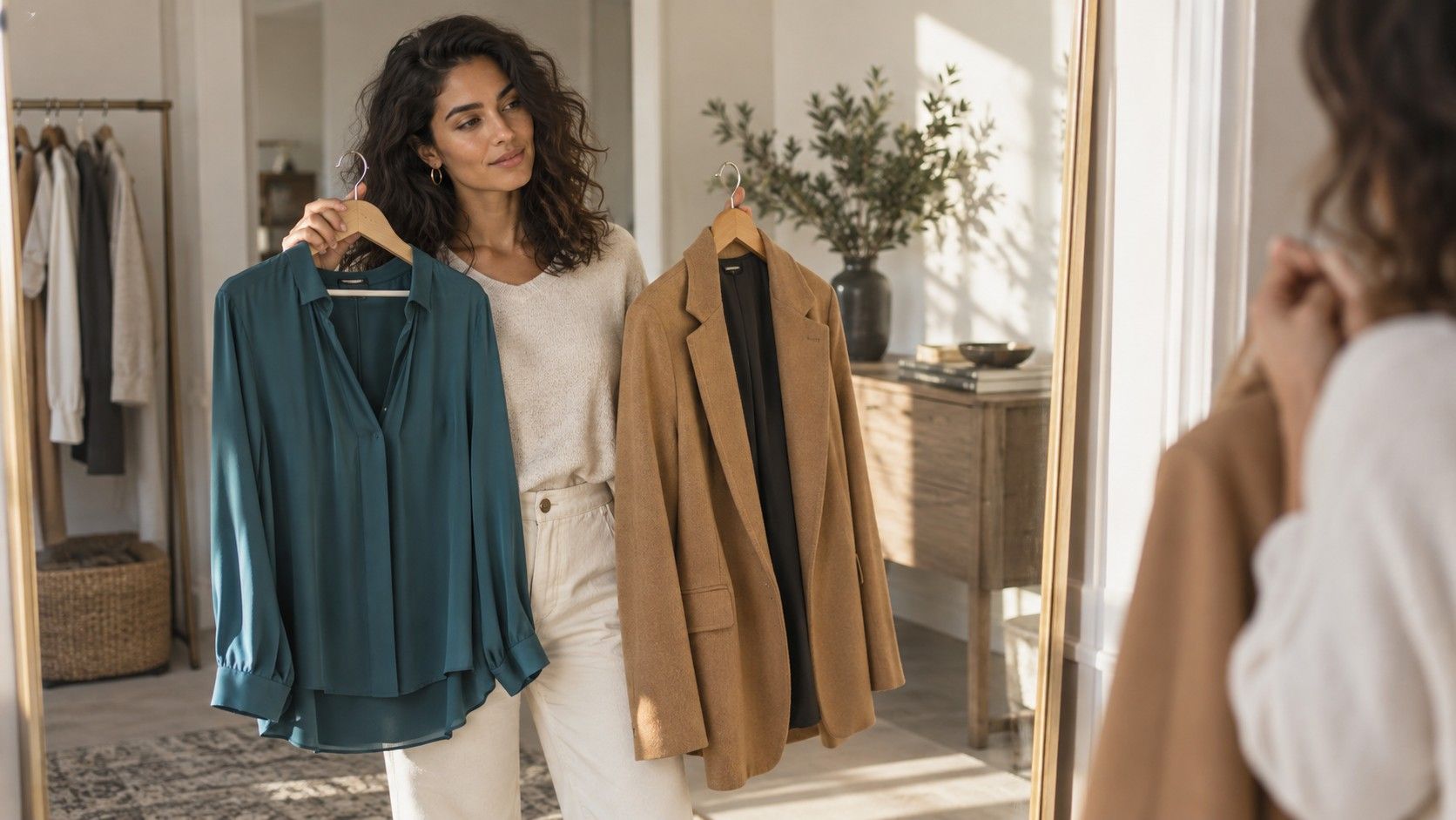
Pale skin is regularly given two unhelpful instructions: wear soft pastels forever, or wear black to create contrast. Both can work, and both can look terrible when the shade ignores undertone, hair color, and the light in which a garment is actually worn. A useful wardrobe is built by noticing what gives the face definition without turning the outfit into a costume.
Start by separating pale skin from a single undertone
Pale skin can be rosy, peachy, neutral, olive-leaning, or cool enough to appear almost translucent in winter. That is why one person looks fresh in butter yellow while another looks washed out in it. Instead of trying to diagnose yourself from veins on the wrist, compare fabric near the jaw in daylight. A color that belongs will make the skin look even; a wrong one often magnifies red patches, shadows under the eyes, or a yellow cast.
Fair cool skin often responds well to blue-based colors: navy, sapphire, berry, plum, cool pink, and charcoal. Fair warm skin can enjoy tomato red, olive, warm teal, cinnamon, and cream. Neutral pale skin may wear from both columns, but needs to decide whether the outfit wants a clean cool finish or a softened warm finish. Mixing every temperature at once is usually what makes the result look accidental.
Choose contrast around the face before choosing a whole palette
Contrast is not a moral virtue; it is simply the difference between your features and the clothes nearest to them. Someone with pale skin, dark hair, and strong brows can often carry ink navy, black, forest green, and bright red with ease. Someone with pale skin and soft blond or light brown hair may find that the same colors arrive before their face does. Deep colors are still possible, but a lower neckline, earrings, a printed collar, or a lighter layer can soften the frame.
At a shop, test the top half first. Hold a sweater under your chin, take one step back from the mirror, then look at the whole face rather than the garment. A color that makes your eyes visible and your skin calm is more useful than one that flatters a close-up fabric swatch. This small test is more reliable than a seasonal color label because it includes your real hair, brows, and everyday makeup.
| Situation | Useful color direction | Easy adjustment |
|---|---|---|
| Low natural contrast | dusty rose, soft navy, pine, mulberry | Choose mid-depth rather than pure black |
| Dark hair or strong brows | ink, cobalt, burgundy, emerald | Use a lighter scarf if the look feels severe |
| Warm fair skin | cream, rust, moss, tomato red | Avoid icy grey near the face |
| Cool fair skin | charcoal, berry, sapphire, blue-red | Keep yellow beige away from the neckline |
Wear deep colors without letting them overpower you
Navy is one of the best clothes colors for pale skin because it provides structure without the hard edge black can have. It works at an office, a dinner, or on an ordinary errand, and it pairs with denim, camel, silver, and most accent colors. Dark green, burgundy, aubergine, and espresso can perform the same job, provided their undertone agrees with yours. A warm burgundy may be better on peachy fair skin; a blue-black berry often suits cooler complexions.
Black deserves a practical test rather than a ban. If a black top makes you look tired, try moving it below the waist or break it with an open collar, a pale necklace, or a jacket in a softer dark neutral. A black dress can look excellent with a lip color or earrings that bring life back to the face. The problem is rarely black itself; it is black sitting unbroken against low-contrast features in flat indoor light.
Make pale shades look intentional rather than faint
Pastels are not automatically flattering simply because the wearer has pale skin. The palest lilac, powder blue, or blush can merge with the complexion, especially under grey winter daylight. Choose pastels with a little dirt or depth: dusty blue instead of baby blue, rosewood instead of sugary pink, pistachio instead of fluorescent mint. Then ground them with a darker shoe, belt, denim, or jacket so the outfit has a clear outline.
White is another case where the label on the hanger tells very little. Crisp optic white can make cool pale skin look clean and graphic; soft white, ivory, and oatmeal often serve warm pale skin better. If a white shirt feels stark, wear it with navy, chocolate, or a colored knit rather than abandoning it. The surrounding colors affect the reflection on the face just as much as the shirt does.
Choose dress colors according to the setting
The best dress colors for pale skin are not identical for a daytime wedding, a work presentation, and an evening restaurant. In daylight, medium blues, greens, berries, and muted red tend to photograph with enough definition. For a formal evening, dark jewel tones can provide drama without the severity of head-to-toe black. For work, navy, pine, soft charcoal, and deep rose are useful because they look deliberate while allowing a jacket or cardigan to change the temperature of the outfit.
Before an event, judge the dress in the light you will actually meet. A warm changing-room bulb forgives beige and coral; a cool office lobby may expose their yellow cast. Put the dress on near a window, then take a simple phone photo with no filter. If your face disappears, the answer may be a stronger earring or jacket, not an entirely different dress.
Build repeatable combinations instead of collecting rules
A compact palette is more helpful than a cabinet of cautious purchases. Pick two dependable darks, two light neutrals, three colors you genuinely enjoy, and one accent that feels slightly braver. A cool fair palette might include navy, charcoal, soft white, dove grey, berry, pine, denim blue, and silver. A warm fair palette could begin with espresso, olive, cream, camel, terracotta, warm teal, brick red, and gold.
Wear each candidate color with trousers and shoes you already trust. The best color clothes for pale skin become obvious through repetition: you put them on without extra concealer, complicated styling, or a pep talk. Keep the shades that make your features look clear and leave room for taste. Color guidance should reduce decisions, not make getting dressed feel like an exam.