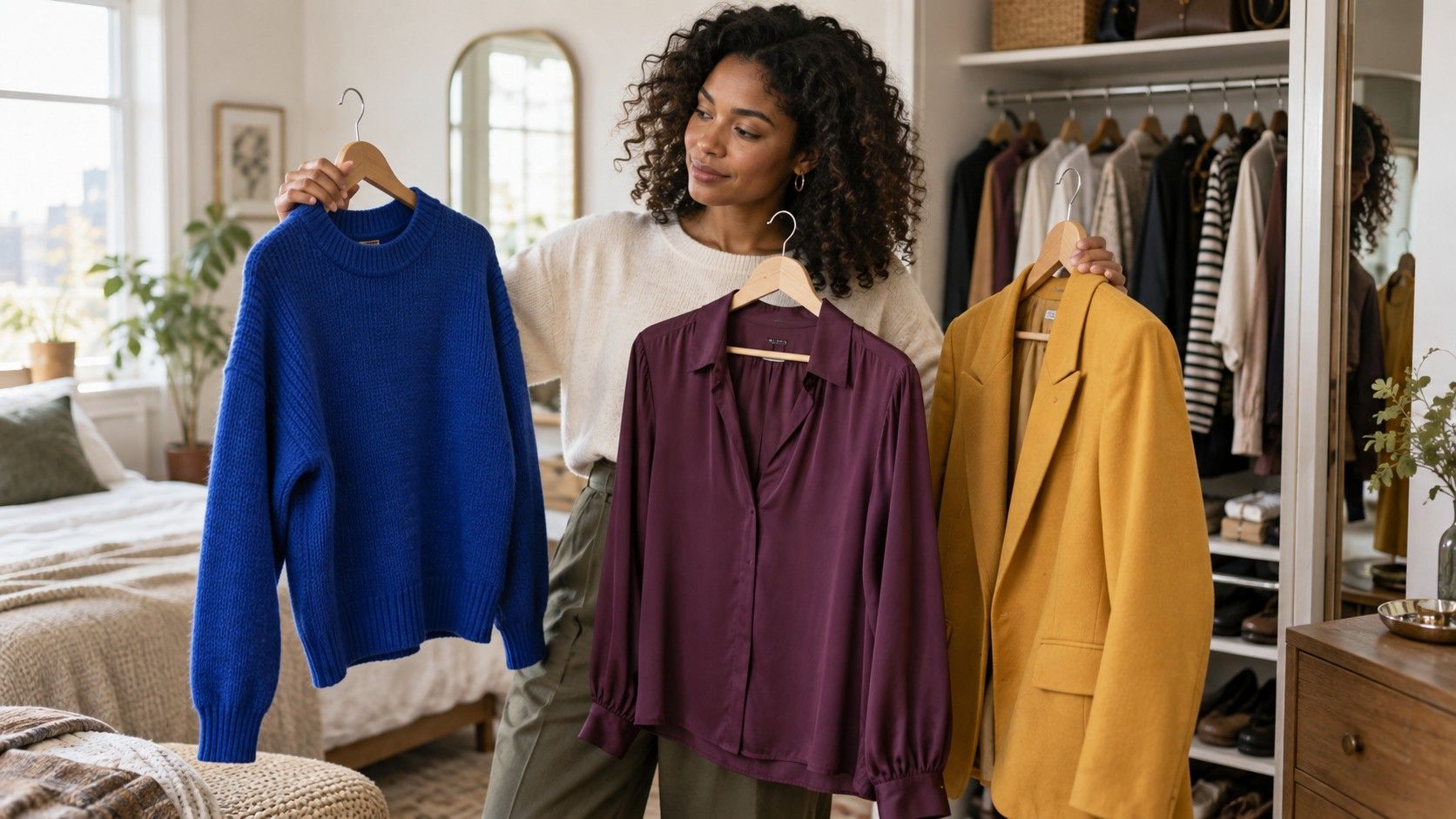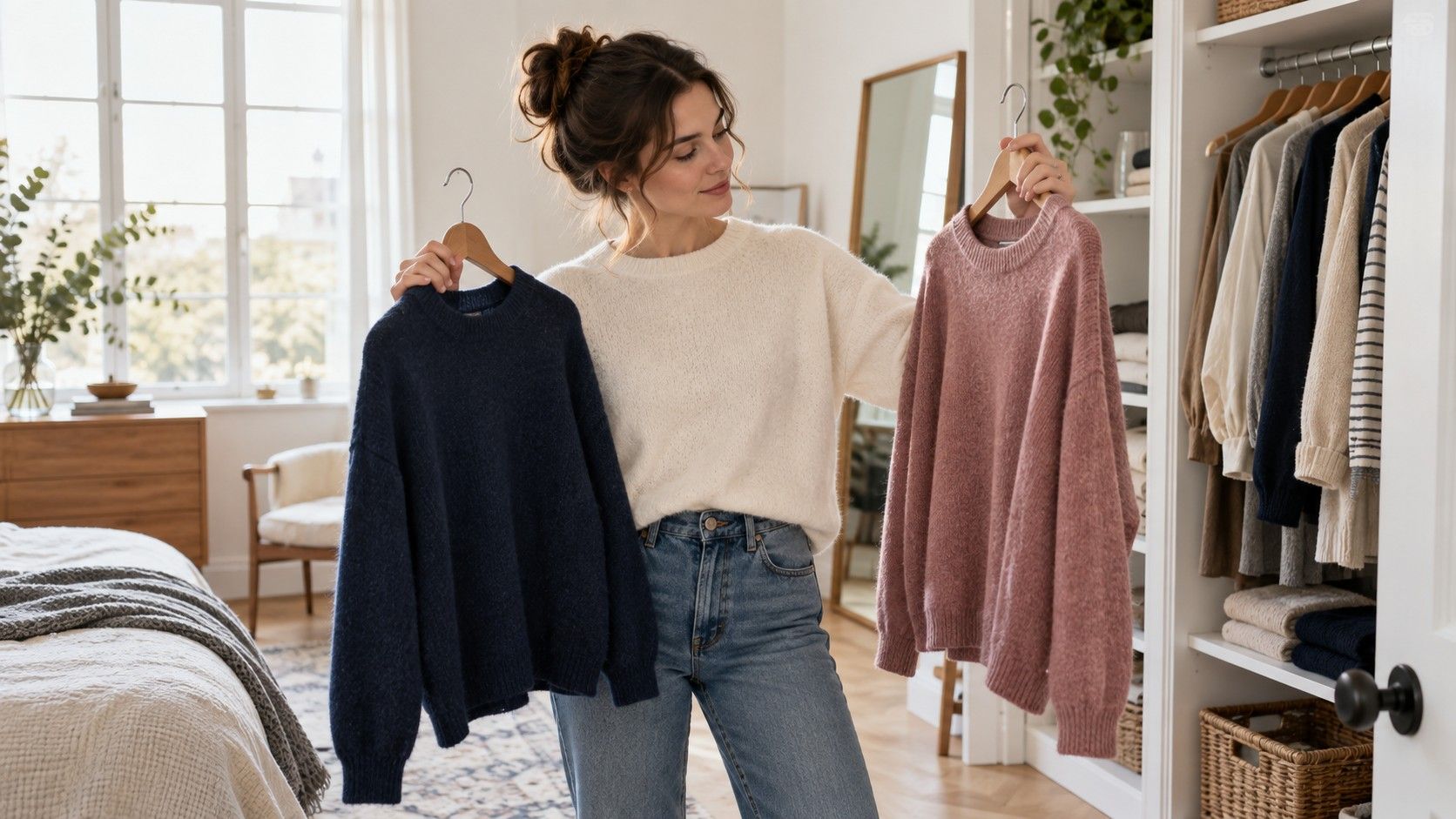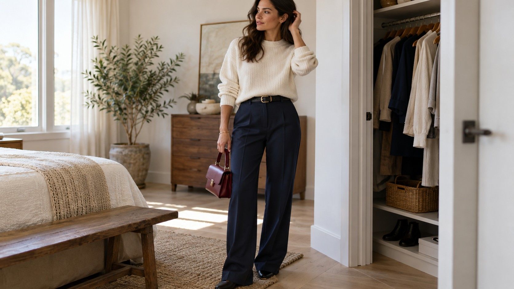
If you have asked what color clothes look best on me, you probably want fewer bad purchases, not a new set of rules to worry about. The most reliable answer comes from looking at a few variables together: how colors change your face in daylight, how much contrast your features naturally have, and what kind of clothes you wear often enough for the result to matter.
Start with what changes your face
Begin with the colors closest to your face. A sweater, shirt collar, scarf, jacket lapel, or earring can affect how rested you look more than trousers ever will. Stand by a window with a plain background and hold two similar fabrics under your chin. Compare cream with bright white, soft navy with blue-black, berry with orange-red, or olive with a cooler green. Look for evenness in the skin, definition around the eyes, and whether your mouth looks naturally present rather than disappearing.
The goal is not to find a magical shade that makes every other color wrong. You are looking for useful evidence. One version may make shadows under your eyes more noticeable, while the other lets the eye go to your expression first. A color can also be technically flattering but feel too formal, sweet, or severe for your style. Keep that distinction. Clothes have to work with your life, not merely perform well in a mirror for thirty seconds.
Use daylight because indoor lighting is a convincing liar. Warm bulbs flatter cream, peach, and camel; cool LEDs can make blue and grey look more polished than they do outside. If you are comparing clothes in a store, step near the entrance or window before deciding. At home, take a neutral phone photo of each comparison if you wish, but trust the mirror first. Phone processing can smooth, brighten, or shift color enough to create a false winner.
Check temperature before chasing seasonal labels
Skin undertone is often described as warm, cool, or neutral. Warm-leaning skin can sit easily with cream, olive, tomato red, warm brown, and golden yellow. Cool-leaning skin may enjoy crisp white, blue-red, berry, cobalt, charcoal, and cool pink. Neutral undertones can borrow from both groups. These are starting points, not guarantees. A person with warm undertones can still look excellent in navy; a cool-leaning person may love camel when the depth is right.
The cream versus white test is a practical first check. Hold an ivory or warm cream top beside a clean, bright white one. If cream makes your face look smoother and white seems hard or grey, warmer or softened neutrals may be easier. If white makes the eyes look clearer while cream appears yellow, cooler or clearer shades may have an advantage. If both work, you may have flexibility, or simply need to judge depth and fabric finish next.
Do not use veins, jewellery, or a single online quiz as a verdict. They can be clues, but they are unreliable in isolation. Compare several color pairs and search for a repeated result. If berry, cool teal, and charcoal keep looking stronger than coral, warm olive, and camel, that tells you more than one bracelet test. The question what colour clothes suit me is answered by your actual face in actual light, not by a label you feel obliged to defend.
| What you notice | Try next | Keep the conclusion flexible |
|---|---|---|
| Optical white looks harsh | Ivory, soft white, oatmeal | Test at different neckline shapes and fabric finishes |
| Bright colors wear you first | Dusty rose, slate blue, sage, softened red | You may prefer lower saturation, not fewer colors |
| Pale shades make you fade | Deep teal, charcoal, wine, dark olive | Depth may matter more than undertone |
| Black looks easy but flat | Ink navy, espresso, deep pine, graphite | A different dark neutral may give better definition |
Notice depth and brightness, not only warm versus cool
Depth is how light or dark a color is. Someone with dark hair and brows may find that pale beige, baby blue, and light grey need a darker companion to avoid looking washed out. Someone with light hair, light eyes, and gentle contrast may find head-to-toe black more noticeable than their face. Neither person needs a rigid palette; they need a workable range. Try medium, deep, and light versions of the same family before deciding that blue, green, or red does not suit you.
Brightness is equally important. Clear, vivid colors have little grey in them: cobalt, emerald, hot pink, clean tomato red. Soft colors are muted: dusty blue, moss, mauve, brick, and smoke grey. If your features are subtle, a very bright top may feel like a signboard. If your coloring is high contrast, a fully muted outfit can look pleasant but lack energy. This is not about being dramatic. It is about whether the color shares the visual volume of your face.
Hair contrast changes with styling and dye, so treat it as current information rather than destiny. A dark-haired person with very light skin has a different frame from the same person after going blonde. Eye color can influence small choices too, especially near the face, but it should not dictate an entire wardrobe. A blue-eyed person is not required to wear blue; a brown-eyed person is not limited to brown. Use eye color as a small echo in a scarf, shirt pattern, or jewellery when you enjoy it.
Compare close alternatives in daylight
Close comparisons produce better answers than dramatic ones. Almost everyone can tell that neon yellow and black create different effects. The harder, more useful question is whether soft white or cool white works better; whether olive should lean mossy or yellow; whether your red is brick, cherry, or wine. Lay the options side by side and change only one factor at a time. A wardrobe becomes easier when you know your version of a color, not merely its broad name.
Pay attention to neckline and scale. A black turtleneck places a large dark field right under the chin. A black blazer over a pale tee gives the face more breathing space. A vivid pattern with a small amount of your less successful color may be fine, while the same shade in a solid sweater is too much. This is why people sometimes conclude that a color is impossible, then happily wear it in a different garment. The distance from the face and the amount of fabric are part of the answer.
Texture can rescue or change a shade. Matte charcoal jersey looks different from shiny charcoal satin; faded denim is gentler than inky denim; a chunky oatmeal knit reflects light differently from a silk blouse. When a color fails unexpectedly, test it in another fabric before excluding it. Real clothing is a mix of dye, texture, fit, and light. A useful method respects that complexity without making the process mysterious.
Make a go-to color list that fits your wardrobe
After a few comparisons, create three short lists. First, write your dependable face colors: perhaps soft white, pine, medium blue, and berry. Second, name your reliable darks and light neutrals: charcoal, dark denim, stone, cream, or chocolate. Third, keep a small accent list for colors you love but do not need in every top. This turns a vague question into a shopping filter. You can judge whether a new blouse adds something useful instead of buying a shade because it looked good in a styled product photo.
Build outfits from one face-friendly color and one neutral before adding an accent. For example, a soft blue shirt with charcoal trousers and burgundy shoes; a cream tee with dark denim and olive outerwear; a berry knit with stone trousers and brown leather. These are not formulas you must follow. They are low-risk starting combinations that make it easier to learn what you like. Photograph the successful ones and keep a small album for rushed mornings.
Keep favorites that sit away from the face. If bright orange does not flatter you as a turtleneck, it can still be a skirt, sneaker, bag, nail color, or print detail. Style should not become an elimination exercise. The useful outcome is knowing where a color is strongest for you and where it needs support from a better neckline color.
Use the result without turning it into a uniform
Color preferences change with season, hair, mood, and the kinds of places you go. Retest uncertain colors after a haircut, a change in hair color, or a shift from summer to winter clothes. Keep the core observations but allow the edges to move. The colors that repeatedly make you look alert in daylight are worth buying in better fabrics; the difficult colors can remain occasional choices when the cut or styling makes them worthwhile.
When you ask which colour clothes suit me, the best answer is usually a small family rather than one shade. You may suit cool, medium-depth, slightly softened colors; or warm, deep, clear colors; or a mix that changes depending on contrast. That is enough information to make real decisions. It gives you a direction without making every outfit a test you can fail.
Use the method as a shortcut to more ease. Choose a few tops that support your face, a handful of neutrals that connect them, and accents that make the outfit feel like yours. If the wardrobe begins to work more often without extra effort, you have found the part of color analysis that is genuinely worth keeping.