A neutral undertone can sound like permission to wear absolutely anything, which is appealing until a supposedly flexible wardrobe becomes a collection of colors that are technically fine and somehow never chosen. Neutral skin usually has room for both warmer and cooler shades, but that room has edges. The better question is not whether a color is allowed; it is whether its warmth, brightness, and depth give your face definition on an ordinary Tuesday rather than only under flattering shop lighting.
Why neutral is not a blank check at the clothing rail
Neutral undertones often sit between clearly pink-blue and clearly golden skin, yet a person can still lean warm-neutral or cool-neutral. That slight lean shows up in repeated choices. You may look awake in muted olive and taupe but flat in icy lavender, or enjoy navy and soft berry while orange-based coral always feels louder than you are. Neither result means a seasonal system has discovered your identity; it means your wardrobe has evidence worth using.
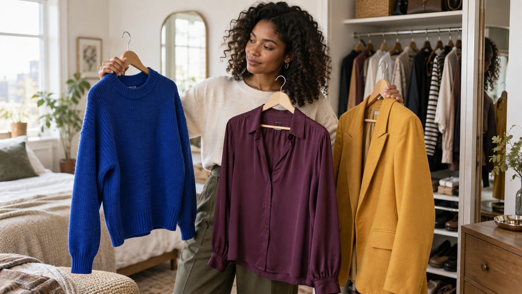
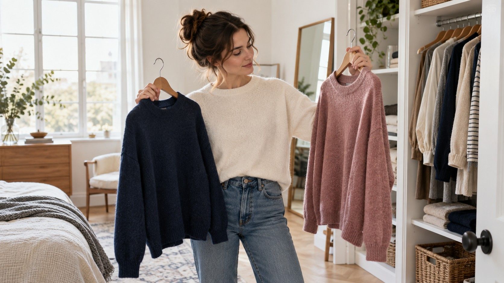
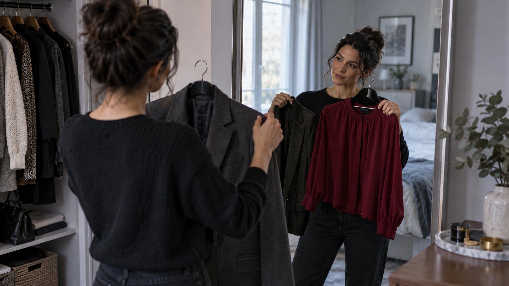
Start with clothes near the face. Hold a warm ivory top and a soft white one at the neckline, then compare a camel jacket with a mushroom-taupe jacket. Use daylight, remove dramatic lipstick if possible, and look at the under-eye area rather than only the skin on your cheek. A neutral skin tone colors to wear guide is most useful when it leads to that kind of side-by-side check, not when it hands you a large rainbow and calls the job finished.
Choose balance before chasing variety
Balanced colors are the backbone of neutral undertone clothes. Think medium navy, softened teal, rose brown, muted red, eucalyptus green, dusty blue, and plum that is neither electric nor muddy. These shades have enough complexity to work beside skin that does not strongly demand one temperature. They are also easier to repeat: a muted teal blouse can meet gray trousers, dark denim, taupe tailoring, or a chocolate bag without looking like a costume change.
Avoid testing colors only in their brightest version. A clear cobalt may be too forceful even if it is cool enough; a pale butter yellow may be too weak even if it is warm enough. Many neutral wardrobes improve when the color is softened by a little gray, brown, or depth. That is why smoky blues, softened berries, and olive-leaning greens often earn more wears than their high-saturation cousins.
Use warm and cool neutrals as a working pair
Neutral undertones can usually borrow from both sides of the neutral rack, which is useful if you build outfits rather than isolated purchases. Navy, charcoal, soft white, and cool taupe form a cooler group. Mushroom, olive, cocoa, warm gray, and muted camel form a warmer group. You do not need to pledge allegiance to one group; use the one that supports the color closest to your face.
For a work outfit, a soft-white shirt with navy trousers may feel cleaner than bright white with black. On another day, a warm-gray knit with olive trousers can look just as balanced. The trick is to avoid stacking every neutral at once. Taupe coat, beige knit, brown trouser, and tan shoes can turn into a beige fog if all four values are similar. Add a navy bag, a berry lip, or a darker belt so the outfit has a stopping point.
| Situation | Useful color direction | What to watch |
|---|---|---|
| Quiet work outfit | Soft white, navy, taupe, muted berry | Keep at least one piece darker for definition |
| Casual denim day | Medium blue, eucalyptus, rose brown | Very pale pastels can look faded in worn jersey |
| Warm-weather dressing | Muted coral, soft olive, stone, cream | Choose softened coral rather than neon orange |
| Evening contrast | Charcoal, deep teal, plum, soft berry | Let one rich color lead instead of using several |
Adjust brightness to your natural contrast
Brightness causes more wardrobe disappointment than undertone labels admit. If your hair, eyes, and skin create clear contrast, medium-to-deep colors and defined combinations may make sense: navy with soft white, deep teal with charcoal, or berry with dark denim. If your coloring reads more blended, a head-to-toe contrast of black and white can arrive before you do. Softer combinations such as dove gray and dusty blue, taupe and muted rose, or olive and cream may look more settled.
Use a simple photograph test. Wear one outfit with a high contrast and another with a low contrast, stand by the same window, and take photos without a filter. The goal is not to rank your face; it is to see which clothes leave the face visible. Neutral skin tone colors to wear female searches often produce endless swatches, but your own successful images reveal whether you need more clarity, more softness, or simply better fit.
Bring in stronger colors without losing flexibility
Neutral coloring can handle richer shades when the rest of the outfit gives them space. A deep blue-green dress can be excellent with simple shoes; a soft berry sweater looks modern with charcoal trousers; a muted red coat feels wearable over navy. Begin with one expressive color and place calm neutrals around it. When every item competes for attention, the result can feel busy regardless of whether the undertone is perfect.
Prints deserve the same approach. A floral print that combines navy, taupe, berry, and soft olive often gives a neutral undertone several familiar notes at once. Check the background first, because it covers the largest area. A cream base may be easier than stark white, while a charcoal background can make a delicate print look more deliberate. If a print is attractive on a hanger but your face vanishes beside it, use it for a skirt, trouser, or bag instead of a blouse.
Make a flexible formula from what you already own
Before buying new colors, pull out ten pieces you wear willingly and put them on the bed. Look for repeating neutrals and accents. You may find that navy, mushroom, denim, and dusty rose already form your actual palette, while the bright pieces you bought on impulse are barely touched. That is a better starting point than trying to own every shade associated with a neutral undertone.
One flexible formula is a medium neutral, a light neutral, and a balanced accent: navy jeans, soft-white shirt, muted teal cardigan; or taupe trousers, cream knit, berry scarf. Another is one-column dressing in charcoal or olive with a layer in a different temperature. Keep the palette broad enough for real life but narrow enough that a new blouse can meet at least three things you already own.
Decide with wear tests, not a final color verdict
Clothing color changes with fabric, weather, makeup, and mood. A warm-neutral camel can be wonderful in textured wool and disappointing in shiny polyester. Navy may look safe in every light but feel too formal for your routine. Give a new shade a proper wear test: put it on for a few hours, see it in daylight and evening light, and notice whether you reach for it again after laundry day.
That last part matters. The best neutral undertone colors to wear are not the colors that pass an abstract test; they are the ones that make your existing wardrobe more useful. If taupe, soft berry, navy, and muted olive produce outfits without effort, keep building there. A flexible palette should make you less dependent on perfect lighting, perfect styling, and a perfect color label.