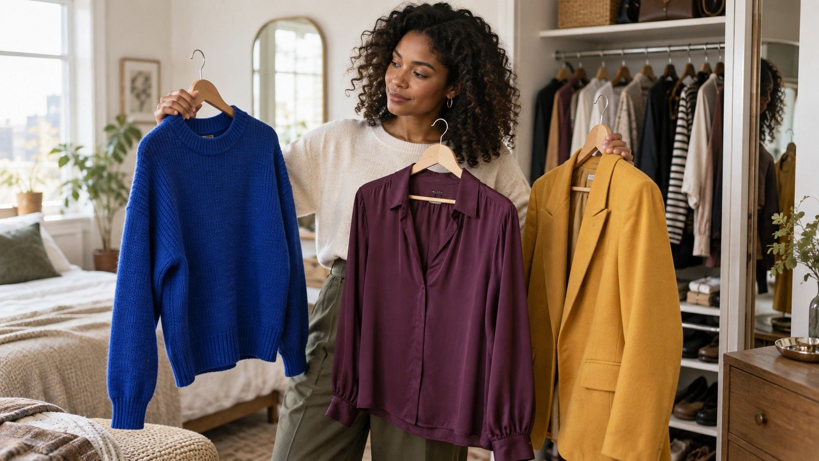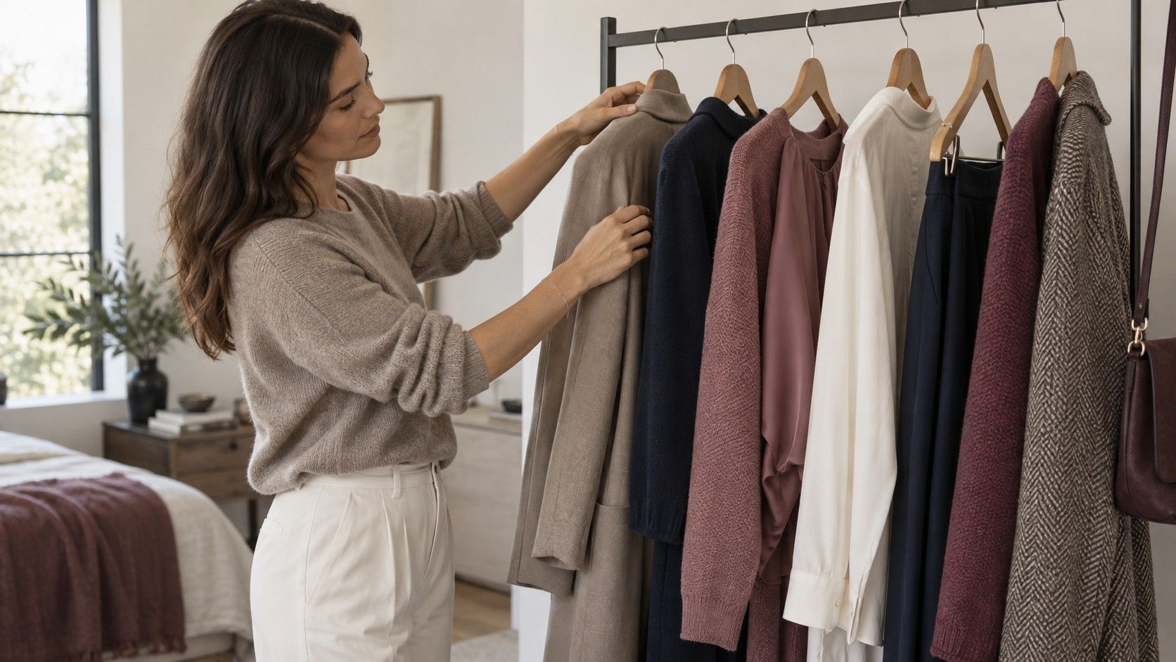
Knowing that you have a cool undertone is less about being assigned to a blue wardrobe and more about noticing which colors make your face look settled rather than overpowered. The useful test happens in ordinary clothes: a knit near a window, a coat in a changing-room mirror, a work shirt under unforgiving office lights. Cool-leaning skin often sits comfortably beside colors with a blue, rosy, or smoky base, but depth, contrast, and fabric still decide whether an outfit feels sharp or merely cold.
Start with the color that sits nearest your face
The neckline does most of the work. A scarf, sweater, jacket lapel, or T-shirt collar reflects color upward, so it is a better place to test cool undertone colors to wear than shoes or trousers. Compare a raspberry top with a tomato-red one in daylight. On many cool undertones, raspberry gives the skin a little clarity while tomato can pull attention toward redness or shadows. That is not a diagnosis and it is not a rule for every person; it is simply a more useful comparison than staring at wrist veins.
Try two colors at a time and keep the rest of the outfit quiet. A medium navy crewneck and a warm camel crewneck can tell you more than a rack of twenty dresses. Look at the area around your mouth and eyes. If one color makes the face look calmer before makeup or jewelry enters the picture, it belongs on the short list. Take a quick phone photo in the same spot if mirrors make every option seem plausible.
Build around blues that have enough personality
Navy is reliable because it is deep, structured, and easy to combine, but it is not the whole answer. Slate blue, denim blue, cobalt, periwinkle, and a smoky blue-green can all work as clothes for cool undertones. The distinction is usually in the base: an inky navy feels more at home than a yellowish marine blue, and a blue-red cobalt tends to look cleaner than a turquoise that leans heavily tropical.
Use depth to match the garment, not a theoretical palette. A dark navy blazer can replace black when black feels severe; a washed denim shirt gives the same cool direction at the casual end. Pale icy blue is striking in silk or a fine knit, but it can look faint in a cheap opaque jersey. If light blue makes you disappear, keep it away from the face and use it as a shirt under charcoal, a skirt with a darker top, or an accent in a print.
Choose reds, pinks, and purples with a blue base
Berry red is one of the easiest wins for a cool palette because it can be vivid without becoming loud. Cranberry, wine, cherry, plum, magenta, cool rose, and mauve give different levels of drama, from a daily sweatshirt to an evening dress. They also solve a common problem: a wardrobe built only from navy and gray can start to resemble a corporate uniform before anyone has chosen a bag.
The practical question is whether the color reads rosy or orange. A dusty rose blouse often works where peach looks strangely separate from the face. A blue-red lipstick is not required to make a berry sweater work, and silver jewelry is optional, though both can reinforce the same visual temperature. For prints, look for combinations such as navy with rose, charcoal with plum, or ivory with cranberry rather than orange with cream.
| Color family | Easy starting shades | Check before keeping it |
|---|---|---|
| Blue | Navy, slate, cobalt, periwinkle | Choose blue or smoky bases over yellow-green ones |
| Red and pink | Berry, wine, cool rose, raspberry | Compare with tomato, coral, and peach beside the face |
| Green | Emerald, pine, blue teal | Avoid shades that turn sharply mustard or olive |
| Neutral | Charcoal, cool beige, soft white, navy | Check whether the neutral adds definition or drains it |
Make cool neutrals earn their place
Black is convenient, not compulsory. For some people with cool undertones, black makes features look crisp and intentional; for others it leaves the face looking a little harder than expected. Charcoal is the excellent compromise: it keeps the authority of a dark neutral while carrying less visual weight. Deep navy, graphite, cool taupe, mushroom, stone, and soft white are equally useful building blocks.
Cool beige deserves more attention than it gets. The right version has a gray, pink, or muted base rather than a buttery one, and it can make a winter coat or wide-leg trouser look much softer than stark gray. Test it against ivory and bright white. Bright white can be brilliant on high-contrast coloring, while soft white often looks more natural when your hair and skin have gentler contrast. Fabric changes the verdict: brushed wool softens charcoal; shiny satin can make even a good cool beige appear oddly yellow.
Wear warm colors by cooling the context
Warm colors are not forbidden territory. The problem usually appears when a warm shade is both bright and close to the face: vivid orange, golden yellow, and honey camel can compete with cool skin instead of framing it. A cooler version is often enough. Choose burgundy over brick, blue-green teal over yellow-green, rose brown over orange brown, or a muted lemon with gray rather than pure marigold.
Placement gives you room to experiment. A warm tan belt, cognac boots, or rust trousers can work beautifully beneath a navy or berry top because the color is farther from the face. If you love a warm camel coat, wear a cool scarf inside the collar and see whether that changes the balance. This is more productive than banishing half a store after a single seasonal color chart says no.
Use contrast before buying more shades
Two people with cool undertones can need very different clothes. Someone with dark hair, clear eyes, and strong natural contrast may enjoy crisp navy-and-white, black-and-berry, or cobalt with charcoal. Someone whose hair, eyes, and skin blend more softly may look better in dove gray with muted rose, denim with cool taupe, or plum with smoky blue. The undertone points you toward a temperature; contrast tells you how much visual volume to turn up.
When you try colors to wear for cool undertones, notice whether the issue is really brightness. A saturated fuchsia can be cool but too intense, while a dusty mauve may be cool and easier. The reverse can be true for clear coloring: muted shades may look stale even though their temperature is right. Keep a small set of photos from successful outfits. After a few weeks, recurring shades are more convincing than one clever label on a color wheel.
Put together a compact, wearable cool palette
A good starter palette needs fewer colors than most guides suggest. Begin with two dark neutrals, perhaps navy and charcoal; two light neutrals, such as soft white and cool beige; then add berry, blue, and green that you genuinely like. That creates enough combinations for work, weekends, and an event without forcing every purchase to match every other purchase.
For example, charcoal trousers, a soft-white shirt, a navy knit, a berry blouse, and an emerald sweater already make a surprisingly flexible rail. Add denim and one structured navy layer, then use bags and shoes in black, cool taupe, or a restrained metallic. Silver can be flattering, but it is not a membership card. The aim is to make getting dressed easier: clothes should support your face and your routine, not make you spend every morning negotiating with a palette.