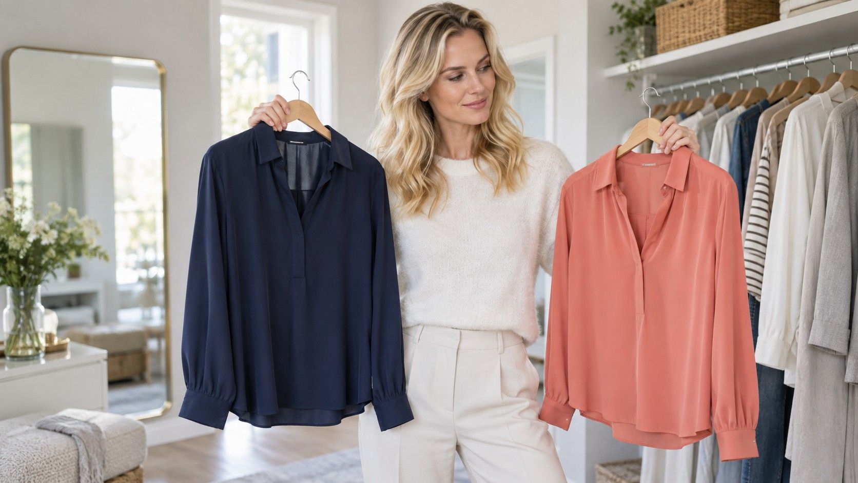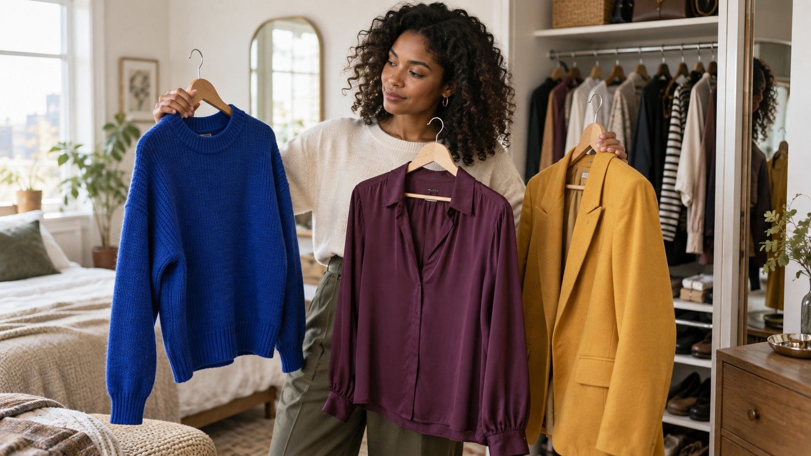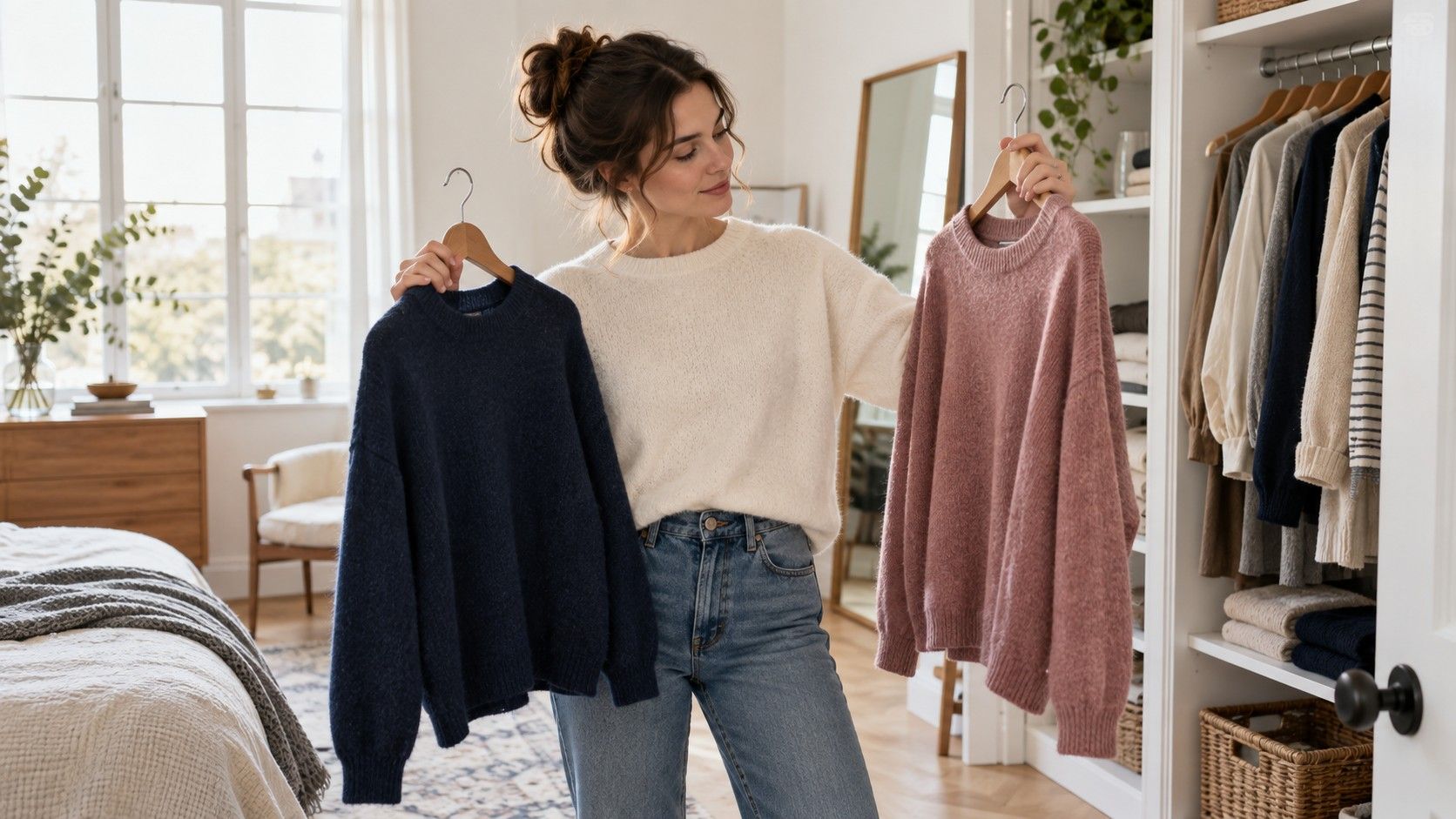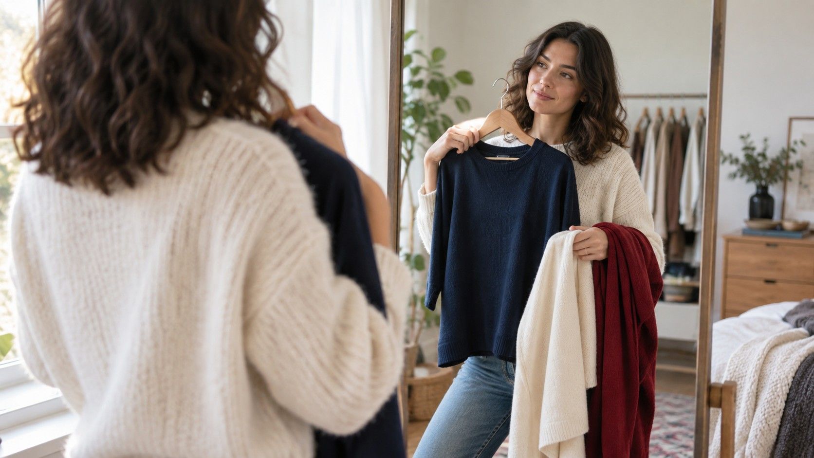
A color test for clothes is most useful when it replaces guessing with a few calm comparisons. The point is not to earn a permanent label or throw away half a wardrobe. It is to notice which colors make your face look rested, which ones make every feature compete, and which neutrals make getting dressed on a weekday much easier.
What a clothing color test can actually tell you
People often expect a colour analysis test for clothes to produce one dramatic answer: warm or cool, bright or muted, keep or donate. Real wardrobes are less tidy. A useful test gives you a pattern instead. You may find that clear blue works better than dusty blue, that cream is kinder than stark white, or that deep charcoal is easier to wear than black close to your face. Those observations are more valuable than a strict season name because you can use them in a shop, at a fitting room mirror, or while choosing a shirt at seven in the morning.
Look for changes in the face rather than whether you simply like a shade on the hanger. A helpful color usually makes the skin look more even, the whites of the eyes clearer, and the mouth more defined. An unhelpful one can make shadows under the eyes seem stronger or turn a small patch of redness into the first thing you see. This is subtle; it is why side-by-side comparison beats trying a single top on one day and trusting a vague memory the next.
Undertone is one clue, but it is not the entire answer. Depth matters too: a person who looks good in cool colors may still need medium rather than icy pale versions. Contrast matters as well. If your hair, skin, and eyes create a soft overall effect, very graphic black-and-white outfits can arrive before you do. If your features have clear contrast, a low-contrast outfit may look pleasant but slightly unfinished. The color test clothes process is about seeing those relationships, not forcing a diagnosis.
Set up a comparison that does not lie to you
Start in daylight near a window, ideally late morning or early afternoon, with direct sun falling beside you rather than across your face. Bathroom bulbs and warm living-room lamps can make yellow, peach, and olive look more flattering than they will outdoors. Remove tinted glasses, heavy scarves, and if possible strong lipstick; they add their own color cast. A plain grey, off-white, or soft beige background is better than a brightly painted wall. Use your phone only after looking with your own eyes, since automatic camera processing can change the result.
Gather fabric rather than relying on tiny color squares on a screen. T-shirts, pillowcases, sweaters, shop samples, or folded scarves all work. Choose pairs that answer one question at a time: ivory and bright white; tomato red and berry red; camel and cool taupe; olive and pine; coral and cool pink. Hold each fabric under the chin so it fills the lower part of the mirror without covering your neck. Give your eyes ten seconds to settle before deciding. The first glance can be biased by novelty.
Take a simple record as you go. Write down the pair, which color looked more balanced, and what changed: less redness, better eye definition, softer jaw shadows, or more presence. Do not write only “good” and “bad.” Later, those notes reveal whether the winning colors share temperature, depth, or saturation. They also protect you from the common mistake of repeating the test months later and deciding differently because you changed the lighting, haircut, or makeup.
| Compare this pair | Watch near the face | What the result may suggest |
|---|---|---|
| Ivory vs bright white | Under-eye shadows and teeth | Warm or softened whites may be easier than optical white |
| Berry vs orange-red | Redness around nose and cheeks | A cooler or warmer red family may be more harmonious |
| Charcoal vs black | Definition of eyes and jawline | Your best dark neutral may not be black |
| Dusty blue vs cobalt | Whether the face looks lively or overwhelmed | You may prefer muted or clearer color intensity |
Test colors where an outfit has the most effect
Prioritize tops, collars, scarves, jackets, and earrings before trousers or shoes. A color worn near the face has far more influence than the same color at the ankle. This makes the test practical for a limited budget: you do not need to replace every item that is less flattering. A favorite olive trouser, rust bag, or bright sneaker can stay in rotation if the top layer gives your face the support it needs.
Neckline changes the comparison. A crew neck creates a broad ring of color below the chin, while an open shirt leaves more skin visible and softens the effect. Test both when possible. Someone who finds black severe in a high-neck knit may still enjoy a black blazer over a lighter tee. Likewise, a color that looks fine in a loose linen shirt can become too much in a fitted turtleneck. The garment shape and the amount of fabric matter along with the dye.
Fabric finish deserves a separate look. Matte cotton, brushed wool, shiny satin, and faded denim can make the same nominal color behave differently. A cool grey in matte jersey may look gentle; a metallic silver blouse can reflect light into the face and feel much sharper. If a shade surprises you, compare it with another fabric before making a rule about that whole color family. A color test should make room for texture rather than pretending every blue or brown is identical.
Separate flattering colors from favorite colors
A favorite color does not fail because it is not your easiest face color. It may suit the mood, signal confidence, or simply make you happy. The useful distinction is between colors that work brilliantly at the neckline and colors that work better as trousers, outerwear, bags, patterns, or accents. This keeps personal style from shrinking into a list of approved swatches. If vivid yellow drains you as a sweater, try it in a printed skirt with a navy top, a belt, or a small earring.
Also separate a bad comparison from a bad color. Many people judge a pale beige after trying it against an especially flattering deep green, then decide beige is impossible. Compare close alternatives instead: oatmeal against mushroom, sand against stone, warm navy against blue-black. The question is usually not “can I wear beige?” but “which beige gives enough contrast and does not make my skin look grey?” This more precise approach produces a wardrobe you can actually shop for.
Seasonal shifts are normal. Summer skin can handle a lighter contrast; winter coats change what sits near your face; hair color can alter the balance. Keep the test results as a flexible reference and retest two or three uncertain pairs when your appearance changes. The stable discoveries tend to be the families you reach for repeatedly, not a single absolute palette written once and never revisited.
Turn the results into clothes you will wear repeatedly
Make three small lists after the test: dependable face colors, workable neutrals, and accent colors. The first list might include forest green, muted raspberry, and medium blue. The second could be soft white, charcoal, and dark denim. The third is where stronger yellow, tomato red, or lavender can live. This is more useful than collecting twenty “best colors” because it tells you how to assemble an outfit: one dependable top, one neutral base, and an accent only if you want it.
When shopping, hold a possible top beside a photo of your best colors or bring a small fabric swatch. Check it under the store’s lighting, then step near a window if you can. Look past the mirror’s flattering angle and ask whether the color makes your face clearer without requiring extra makeup. For online orders, keep two close options if returns are easy and compare them at home in the same daylight setup. Names such as sage, taupe, rose, and navy vary wildly between brands.
Finally, use the test to reduce decision fatigue, not create more of it. A small rail of reliable shirts and knitwear makes it easier to experiment with cuts, prints, and accessories because the color foundation is already settled. The best result is not a perfect palette. It is opening the wardrobe and knowing that most of the things near your face will give you a fair chance on an ordinary day.