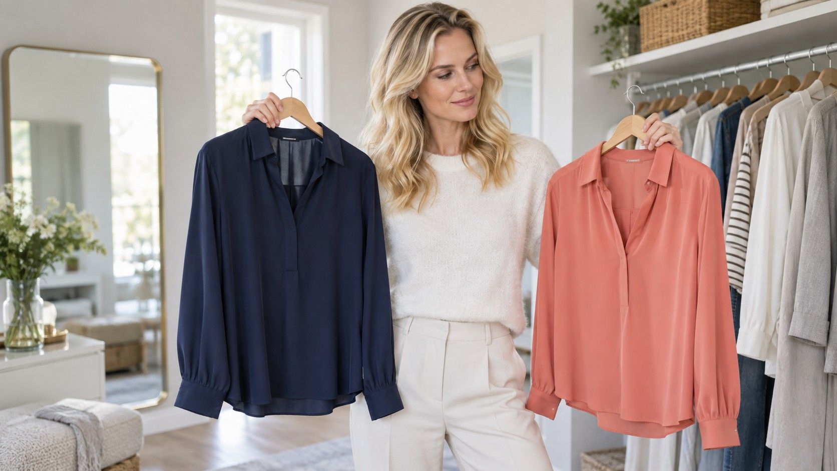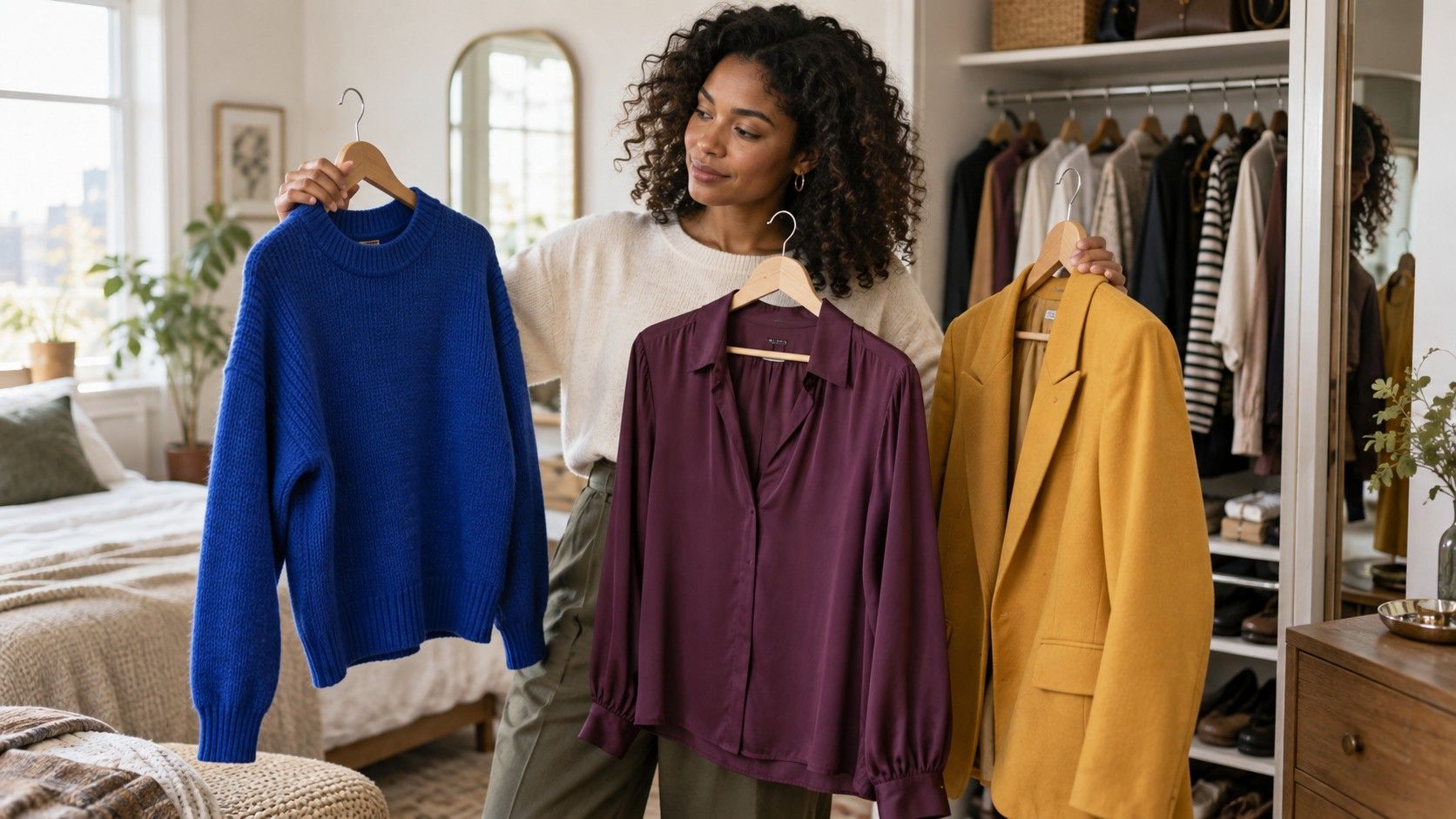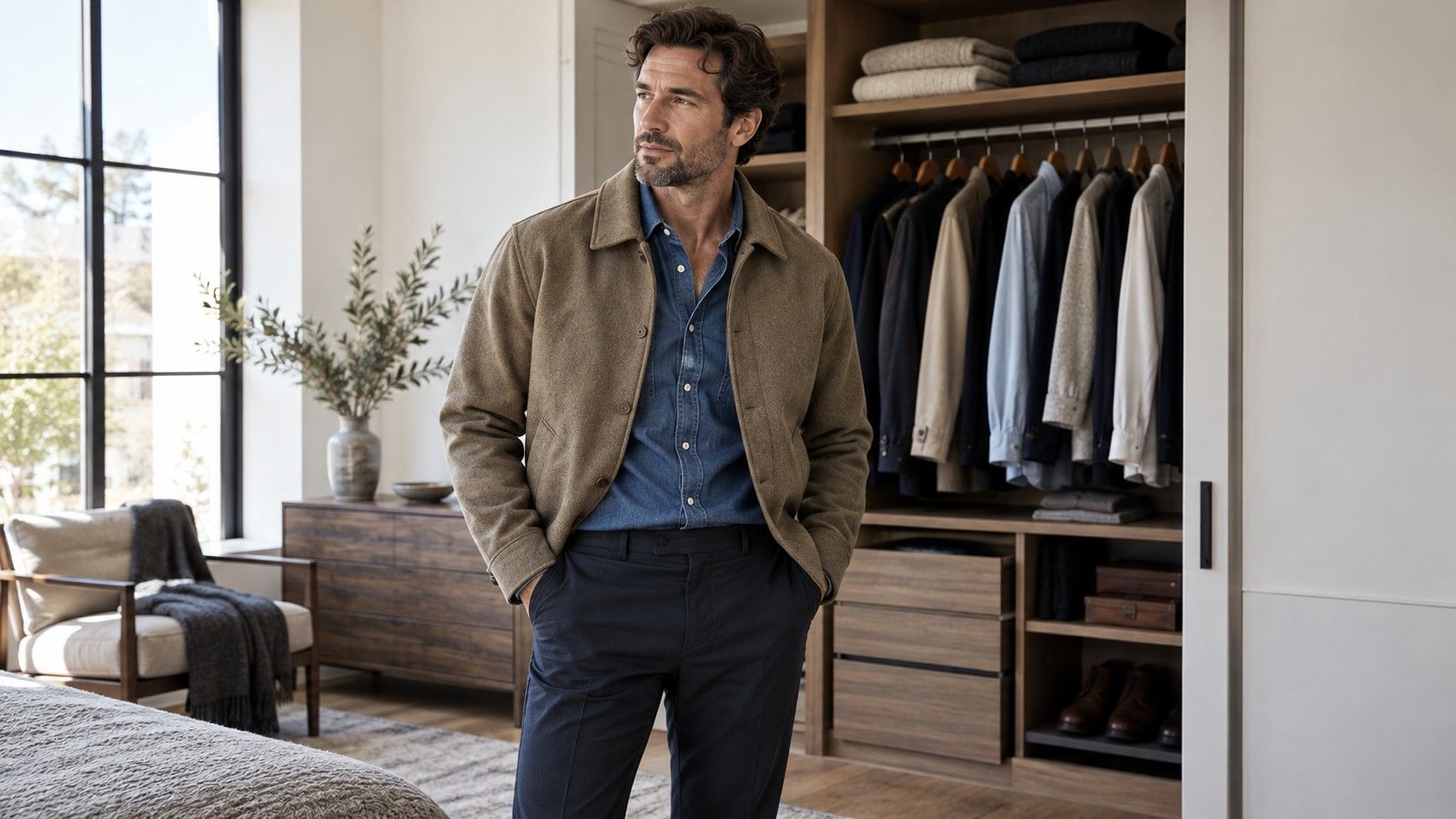
A color matching chart for clothes is useful when it saves a morning, not when it turns getting dressed into a paint-by-number exercise. Most wardrobes already contain workable pairs; the problem is that a busy rail makes them hard to see. Treat a chart as a map of possible relationships, then check the actual fabric, proportion, and daylight before you leave the house.
Read a chart as a starting point, not a list of rules
Charts usually show neighboring colors, contrasting colors, and a handful of neutrals. That is enough to begin. Neighboring colors, such as olive and mustard or navy and burgundy, make a blended outfit with low drama. Contrasts, such as cobalt and camel or red and green, create more energy and need cleaner shapes. Neutrals give both approaches somewhere to land.
The missing information is value: how light or dark each piece is. A pale blue shirt and pale grey trouser may match on a color wheel but can look vague together. Add a dark belt, shoe, or jacket and the same colors gain structure. Conversely, black jeans, a black boot, and a dark red top may be harmonious yet feel heavy because every surface has the same depth. A chart cannot judge that for you.
Begin with the largest piece you are actually wearing
Start with trousers, a skirt, a dress, or a coat, because it occupies the most space. Blue denim is unusually forgiving: it accepts white, cream, rust, pale pink, forest green, grey, and most shades of navy. Brown trousers are more selective but reward attention; cream, blue, olive, red-brown, and warm pink usually work better than cold lilac or hard black.
This order prevents a common mistake: falling in love with a small accent and building a difficult outfit around it. A mustard handbag does not need a mustard top. Let the bag answer something quieter, perhaps a camel coat button, a brass earring, or the warm thread in a scarf. When the largest item and second-largest item make sense, accessories can be almost boring and the outfit will still feel complete.
| Base item | Easy partners | Useful third note |
|---|---|---|
| Mid-blue denim | Cream, red, olive, navy | Tan leather or silver |
| Black trousers | White, camel, burgundy, soft pink | Grey, denim, or one gold detail |
| Chocolate brown | Ivory, teal, rust, pale blue | Cognac or muted green |
| Olive | Black, cream, navy, dusty rose | Brown leather or gold |
| Grey | Red, blue, lavender, burgundy | Black or dark navy |
Keep the visible palette to two or three colors
A color matching clothes chart becomes much easier when you count visible color families rather than individual garments. Denim, navy, and faded blue can read as one blue family. A white shirt, cream trainer, and ivory tote can read as one light neutral. With that approach, a striped top is not automatically a fourth-color emergency; it may simply repeat colors already present.
For a two-color outfit, let one color dominate. Black trousers and a burgundy knit look calm because black has the larger share and burgundy gets a clear role. For three colors, use a base, a supporting neutral, and one accent: blue jeans, a cream shirt, and a red cardigan. If all three have equal visual force, the eye has nowhere to rest. That can be deliberate for an evening look, but it is rarely the easiest answer on a weekday.
Use contrast deliberately around the face
The top half of an outfit does more than the shoes because it sits beside your skin and hair. Strong black-and-white contrast can look sharp on someone with dark hair and clear features, but it can overwhelm someone whose coloring is softer. The solution is not to abandon contrast altogether. Swap optic white for cream, black for charcoal or espresso, or put the strongest contrast below the waist.
Try the mirror test at a normal distance. If you notice the shirt before you notice the person, reduce saturation or contrast near the face. A bright cobalt sweater may be excellent with denim, while a cobalt scarf wrapped close to the chin feels louder. This small adjustment is more useful than memorizing a universal palette because the chart cannot know your own contrast level.
Let shoes and accessories repeat rather than match exactly
Brown leather does not have to match brown leather. A chocolate bag, cognac boots, and a medium-tan belt can look richer than a perfectly matched set, provided the undertones are compatible. Warm with warm is usually safe; very orange tan next to cool taupe is harder. Black accessories behave similarly: matte black suede and polished black leather create texture, while a random navy bag can look accidental unless navy appears elsewhere.
Repeat a color once in a small place when an outfit looks unfinished. A green earring with an olive trouser, a red lip with a burgundy bag, or navy socks under blue jeans can create a quiet link. Do not repeat every color. The old habit of matching shoes, belt, bag, and jewelry exactly makes an outfit look assembled from a department-store mannequin rather than lived in.
Check fabric and lighting before calling a pairing finished
Color is never seen in isolation. Navy wool, navy denim, and navy satin can look like three different colors because texture changes reflection. Before rejecting a pairing, put the pieces on together near a window and step back. A combination that looks muddy under a warm dressing-room lamp may become clear in daylight; a pale knit that looks elegant at home may disappear against an overcast street. Give the outfit one real-world check before making a verdict.
Handle prints without turning them into a puzzle
Choose one color from a print and treat it as the outfit's solid-color partner. A floral blouse with navy, rust, and cream works easily with navy trousers or cream jeans. Do not attempt to represent every shade in the print through shoes, bag, and cardigan. The print has already supplied visual information; the solids should make it readable, not compete with it.
When in doubt, photograph several combinations on a chair or use a full-length mirror near a window. Keep a small album of combinations that survive real errands, sitting down, and a slightly messy commute. The best color chart for clothes eventually becomes personal: it records the denim, neutrals, accessories, and fabrics you actually own, instead of promising a perfect outfit from colors you never wear.