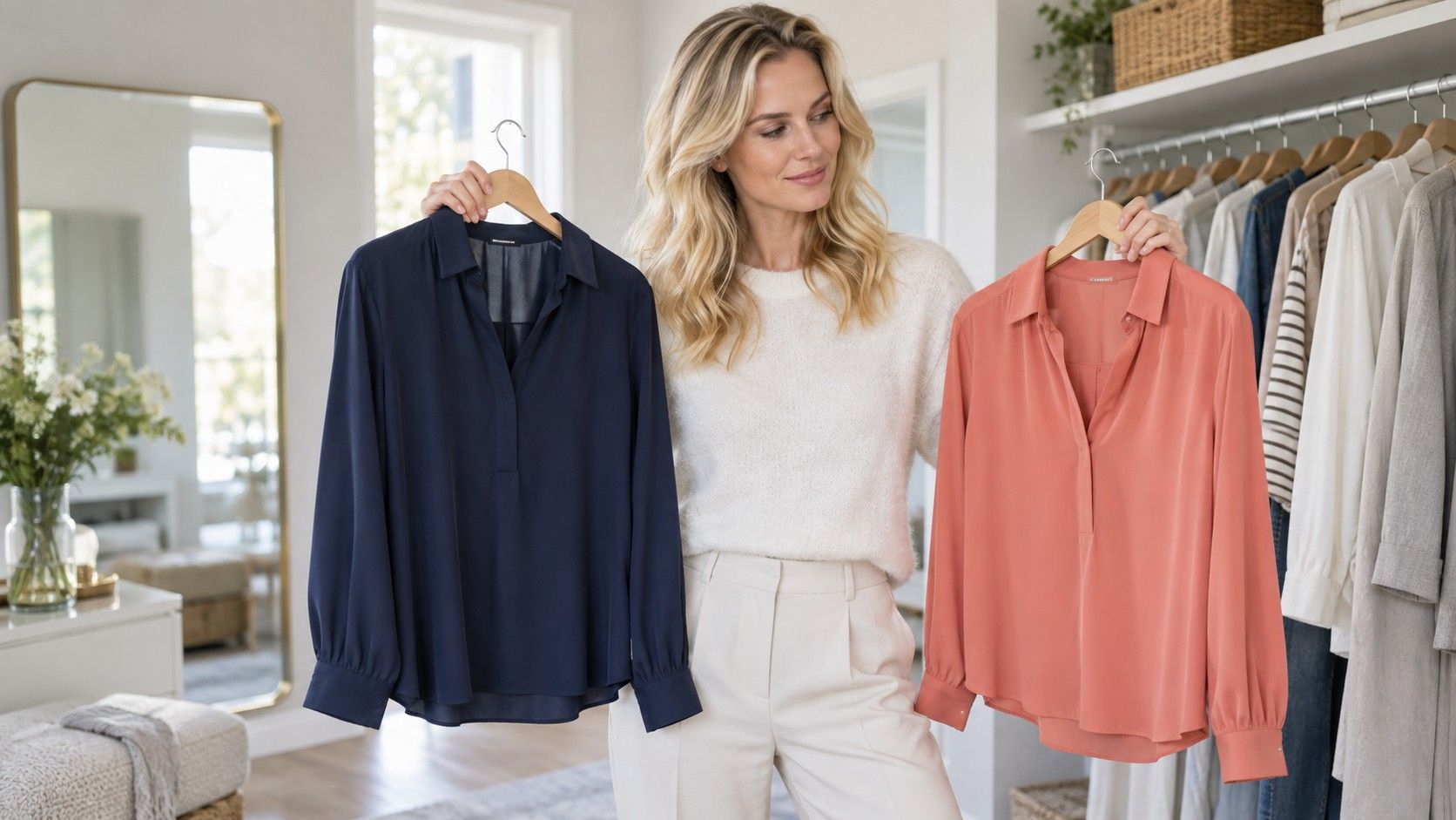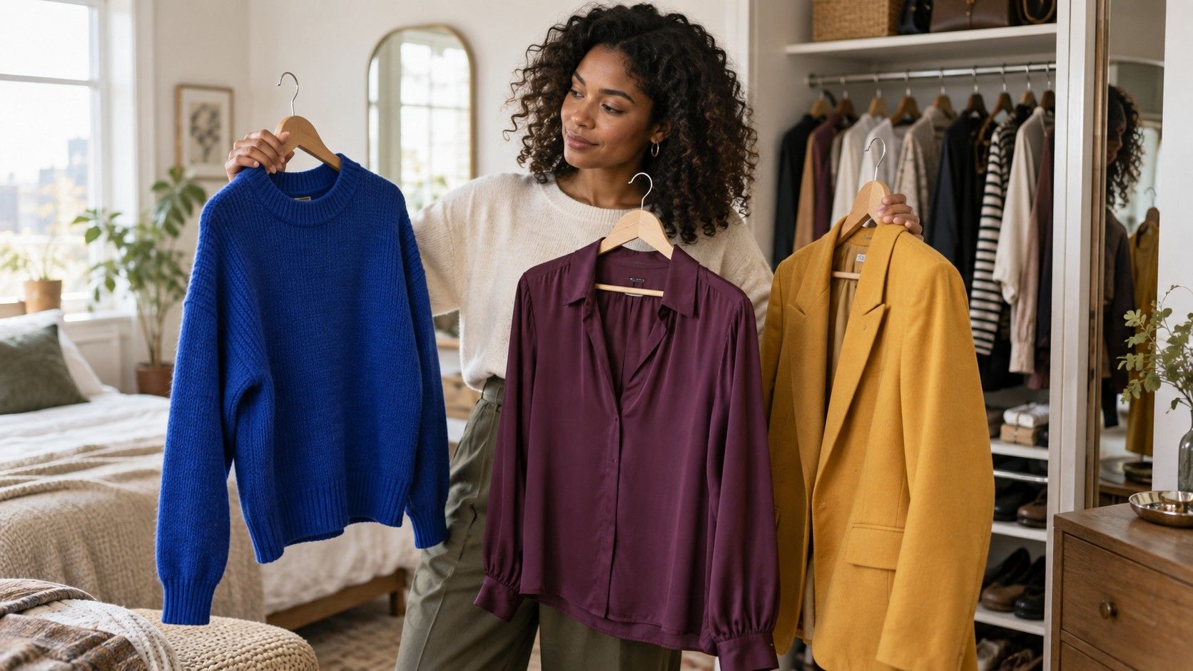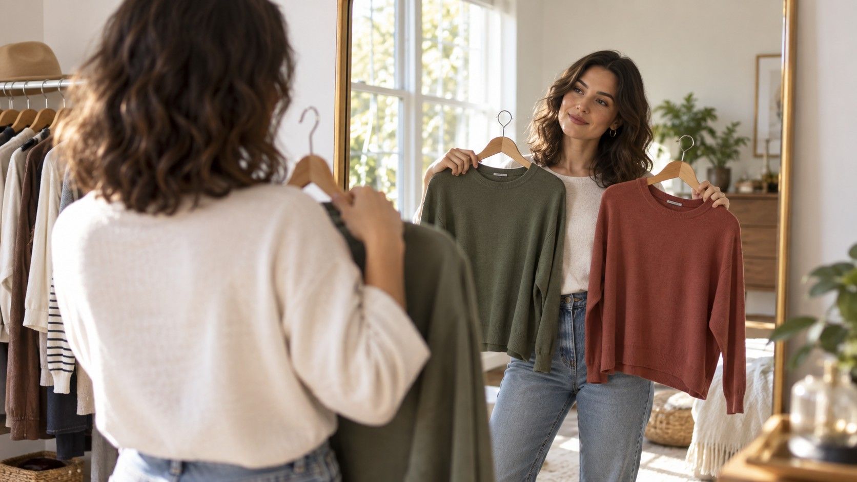
A color formula guide for clothes is most helpful on the days when taste has temporarily left the building. You have clean laundry, a calendar, perhaps five minutes, and no desire to audition every top with every trouser. Formulas reduce the number of decisions. They are not style laws; they are dependable starting points that can be made quieter, brighter, softer, or sharper depending on the occasion.
Use a formula when the wardrobe feels busy
Color friction usually comes from too many equally important pieces. A printed shirt, bright trouser, colored trainer, and statement bag may all be nice individually, but together they ask for constant attention. A formula gives the eye a hierarchy: a base color does the practical work, a second color adds character, and a smaller accent creates the finish. The familiar 60-30-10 idea describes proportion, not a measuring exercise with a ruler.
Look at the outfit from across a room. Roughly sixty percent might be navy trousers and a navy coat, thirty percent a cream knit, and ten percent a burgundy scarf or shoe detail. The numbers can shift, especially with a dress, but the principle remains: one color should have permission to lead. If every item is an accent, none of them is.
Formula one: tonal dressing with a change in texture
Tonal dressing uses different versions of one color family: pale blue with denim and navy, camel with tan and chocolate, or grey with charcoal and silver. It is not the same as exact matching. Exact matches can look like a uniform, while a few steps of lightness and darkness create depth. The easiest tonal outfits use one material with softness and another with structure, such as a fine knit with denim or wool trousers with a cotton shirt.
Brown is especially good for this. Try a warm ivory tee, tobacco cardigan, chocolate trouser, and medium-brown loafer. The outfit has several colors on paper but reads as one calm story. If it feels flat, add a small contrast in metal, eyewear, or a bag. Tonal dressing is also a practical travel-free formula for mornings when you want polish without a complicated silhouette.
Formula two: one neutral plus one real color
A neutral base plus color is the everyday workhorse: black and cobalt, grey and red, cream and forest green, navy and pink, or olive and rust. The neutral keeps the color from becoming a costume, while the colored piece keeps the neutral from becoming anonymous. Start with the piece that already earns its place in your life, such as black jeans or a navy skirt, rather than buying a dramatic accent that has no partners.
Choose the color's placement according to confidence and proportion. A bright sweater makes the upper body the focus. A colored trouser has more impact but can be softened with a quiet top and shoes. A bag or shoe lets you experiment with an unfamiliar shade at low risk. The formula works because it leaves plenty of visual space, not because neutrals are inherently more sophisticated.
| Formula | Simple example | Best adjustment when it feels wrong |
|---|---|---|
| Tonal | Cream, camel, chocolate | Increase the difference in texture or depth |
| Neutral plus color | Navy, cream, forest green | Make the color smaller or less saturated |
| Two neutrals plus accent | Denim, tan, red | Repeat the accent once only |
| High contrast | Black, ivory, cobalt | Move contrast away from the face |
| Print plus solid | Floral blouse, navy trouser | Pick one print color for the solid |
Formula three: two neutrals and one repeated accent
This formula is useful when a plain outfit needs a pulse. Combine two neutrals, such as blue denim and camel, then repeat one accent in two small places: a red knit with a red lip, a green sock with a green earring, or burgundy shoes with a burgundy strap on a watch. The repetition tells the eye that the color is intentional, even when the accent occupies very little space.
Keep the repeats related rather than identical. A tomato-red bag with a blue-red berry lipstick can look disconnected, whereas a brick-red bag with a warm red lip makes sense. The same goes for metals. Gold is an accent too; when it appears in earrings, belt hardware, and a watch, it can replace another color rather than compete with it.
Formula four: a printed piece and a borrowed color
Patterns look complicated only when you ask them to do too much. Take one grounded color from the pattern and borrow it for the rest of the outfit. A striped shirt with navy and cream can take navy jeans or cream trousers. A floral skirt containing plum, olive, and tan can be paired with an olive knit. The solid color should usually be one of the larger areas in the print, not a tiny surprise dot.
Leave room around a print. If the skirt is busy, choose a plain top, quiet shoe, and bag without a large logo or another pattern. Mixing prints can be stylish, but it needs a shared color and a difference in scale: narrow stripes with a larger floral, for example. It is a choice for a day when you want visual energy, not a compulsory graduation from basic dressing.
Formula five: control high contrast instead of fearing it
High contrast is created by a large jump in lightness or color: black with white, navy with lemon, burgundy with pale pink. It can look crisp, modern, and wonderfully direct. The issue is placement. A black blazer over an optic-white shirt creates the strongest contrast directly around the face; that may be perfect for a formal setting and tiring for someone with low natural contrast.
Soften the formula without abandoning it. Use cream instead of white, charcoal instead of black, or place the darkest color in trousers and shoes. Add denim between two hard colors to make the transition less abrupt. A color guide for clothes should expand options, and high contrast is one of them; it simply benefits from a quick mirror check before it becomes the headline of the outfit.
Formula six: choose color intensity for your own contrast
Two people can wear the same palette and need different versions of it. Someone with dark hair and clear coloring may enjoy navy, ivory, and bright red. Someone with softer coloring may prefer smoky blue, oatmeal, and brick red. Neither choice is more advanced. The useful question is whether your face looks present beside the clothes, rather than whether the clothes look impressive on a hanger.
Test this with two tops in the same family: clear emerald versus moss, hot pink versus rose, cobalt versus soft denim. Take a photo in daylight without a filter. The better color often makes the skin look more even and the eyes more awake; the harder one is noticed first. Personal contrast changes with hair color, tan, glasses, and makeup, so keep the conclusion flexible.
Formula seven: repeat successful combinations until they become yours
The point of a colour formula guide for clothes is not to produce seven different outfits once. It is to reveal the combinations that make your wardrobe practical. When navy, cream, and red works, repeat it through a cardigan, scarf, shoe, or bag. When chocolate, blue, and gold works, let it appear in jeans, knitwear, and outerwear. Repetition creates a recognizable personal palette without requiring a capsule wardrobe with strict limits.
Keep a few outfit photos that worked under ordinary conditions: sitting at a desk, standing in grey weather, carrying a coat, and wearing your actual shoes. These are better evidence than an idealized color chart. A formula has done its job when you stop noticing it and simply get dressed in colors that feel coherent, useful, and convincingly your own.