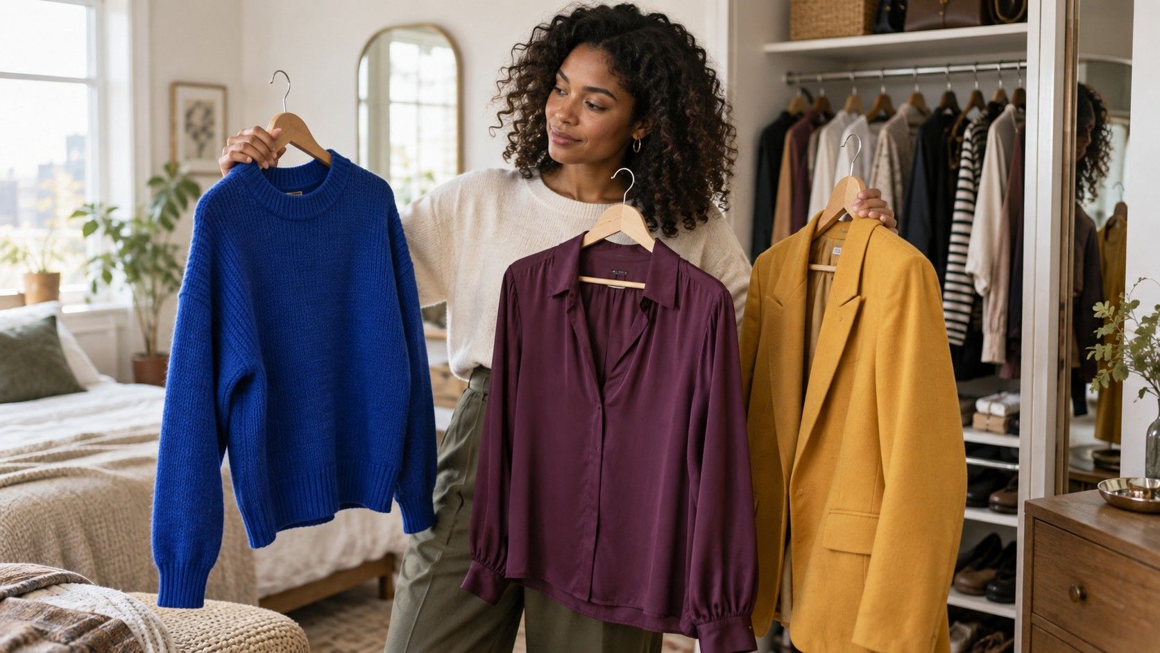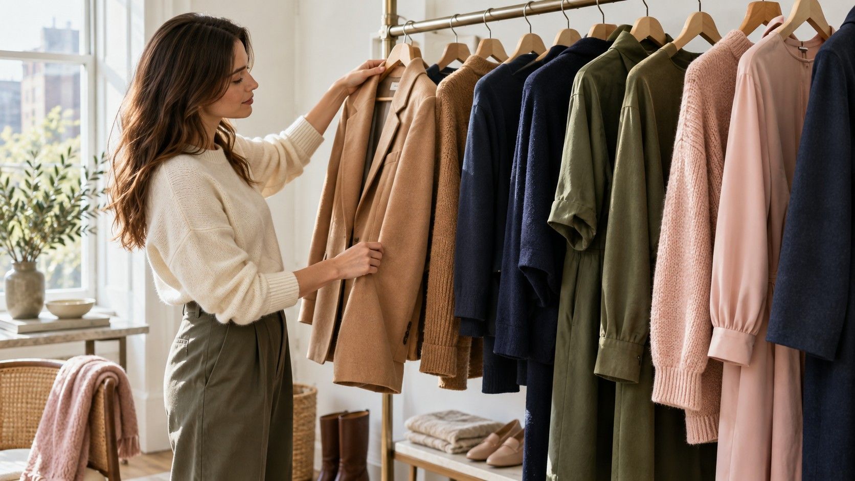
A color chart for clothes can make getting dressed feel simpler, provided you treat it as a map rather than a rulebook. It can show why a navy shirt and rust trouser feel grounded, why two soft colors can disappear together, and why an outfit with technically matching shades can still look dull. The useful part begins when you turn the chart into decisions for the clothes you already own.
Read a clothing color chart as a starting point
Most clothes color charts borrow from the color wheel. Colors beside each other are analogous: blue with teal, olive with mustard, plum with berry. Colors across from one another are complementary: blue and orange, red and green, purple and yellow. That language is helpful, but garments are not flat paint chips. Denim is faded, knitwear absorbs light, skin adds a color of its own, and one navy may be almost black while another is clearly blue. Use the chart to generate a pairing, then judge it in the mirror.
The first thing to notice is value, meaning how light or dark a color is. A pale blue blouse with pale grey trousers can be elegant, but if both are equally light and equally muted, the outfit may lack a focal point. Add a darker shoe, belt, jacket, or bag before assuming the colors are wrong. Conversely, a black top with bright white trousers creates strong value contrast; that can look crisp on one person and severe on another. The chart does not decide which feeling you want for the day.
Saturation is the other quiet variable. Saturated colors are clear and intense, like cobalt, scarlet, or emerald. Muted colors contain more grey or brown, like slate, brick, or sage. A color chart clothes combination often looks better when the saturation is related. A dusty rose sweater with soft charcoal trousers has a shared calmness. Pair the same sweater with neon green sneakers and the relationship becomes deliberately sharp. Neither is forbidden; the question is whether the contrast looks intentional.
Choose the dominant color before adding anything else
Start with the garment that occupies the most visual space or sits closest to your face. For many everyday outfits, that is a shirt, knit, dress, or jacket. Decide what job its color needs to do: look polished for a meeting, feel relaxed at the weekend, or make a simple outfit less anonymous. Once a dominant color is chosen, every later choice has a reference point. Trying to select shoes, bag, trousers, and top at the same time is how a chart becomes overwhelming.
A dominant color does not have to be bright. Deep navy, chocolate brown, olive, charcoal, and warm cream can anchor an outfit as effectively as red. The advantage of a colored neutral is that it offers more personality than black while remaining easy to repeat. Navy works with stone, light blue, burgundy, and many greens. Olive has an easier conversation with denim, ecru, rust, black, and soft pink than its military association suggests. The practical test is whether you can name three things already in your wardrobe that support it.
Keep the three-color rule loose. It is a useful ceiling when you are learning, not a law. A navy blazer, white tee, and tan trouser already contain three color families if you count the leather. Add a small red bag and the result can still look coherent because the red is an accent, not a new block of fabric. Patterns complicate the count too. Instead of counting every stripe, identify the dominant field, the secondary color, and the one detail you want the eye to notice.
| Dominant color | Easy supporting neutrals | Accents that usually read intentional |
|---|---|---|
| Navy | Soft white, stone, denim, camel | Burgundy, coral, grass green |
| Olive | Ecru, chocolate, charcoal, dark denim | Rust, dusty pink, cobalt |
| Charcoal | White, pale grey, taupe, black | Berry, teal, mustard |
| Chocolate brown | Cream, light blue, tan, black | Turquoise, tomato red, lilac |
Add a neutral that supports rather than competes
Neutrals are not an absence of color. Black, navy, charcoal, grey, cream, camel, taupe, denim, and chocolate each have a temperature, depth, and mood. Choosing the right neutral is often the difference between a color chart for clothes that feels useful and an outfit that seems slightly off. A soft, warm camel can make a muted green look richer; a cool pale grey can make the same green look more restrained. Neither one is universally better.
Black and navy deserve a practical note because many people avoid them together out of habit. They can work very well when their difference is visible. A medium or true navy next to black reads deliberate when one piece has texture, such as blue denim with a black knit, or when a white or silver detail separates the blocks. Trouble begins when the navy is so dark that it looks like faded black in low light. In that case, the outfit may appear accidental rather than tonal.
Give pale neutrals enough definition. Cream trousers with a beige top may need a darker belt, structured bag, or shoe to prevent the middle of the outfit from becoming one soft field. This is not a command to add black. Dark brown, chestnut, navy, deep olive, and burgundy can provide a gentler line. The best neutral is the one that helps the main color stay visible while still fitting the occasion and the amount of contrast you enjoy wearing.
Use contrast deliberately instead of by accident
Contrast can come from color temperature, lightness, saturation, texture, or print. A high-contrast outfit might be a white shirt with black trousers, a cobalt sweater with camel chinos, or a vivid orange scarf against navy. Low contrast might be soft blue with grey, olive with khaki, or chocolate with deep burgundy. Both are useful. High contrast tends to look clearer at a distance and can feel energetic; low contrast can feel calm and expensive-looking, but needs some variation in texture or shape to avoid going flat.
Complementary colors are powerful, so reduce one side when you want an everyday result. Instead of a bright orange top with a bright blue skirt, try a rust knit with dark denim, or a pale blue shirt with a tan leather belt. The relationship remains, but the outfit no longer resembles a diagram. This is especially useful when one color is close to the face: let it be the shade that makes you look alive, and keep its opposite in a quieter accessory or lower-half garment.
Try a contrast test before leaving home. Stand a few steps from the mirror and look for the first thing your eye lands on. If it is a random sock, logo, or harsh seam, the outfit may need a better focal point. If the eye moves naturally from face to the main garment and then to a small detail, the colors are doing their job. This check takes less than a minute and is more reliable than memorizing every line on a colour chart for clothes.
Build combinations you will repeat, not one-off outfits
Make a small personal chart from successful outfits rather than collecting generic palettes online. Photograph combinations that felt easy to wear: dark denim with cream and forest green; charcoal with pale blue and silver; black with camel and a small red accent. Note the season, shoe color, and whether the outfit worked in daylight. After a few weeks, patterns appear. You may discover that most of your reliable looks use one deep neutral, one light neutral, and one muted color rather than the bold pairings you save for inspiration.
Repeat a formula with different garments. If navy trousers, a light blue shirt, and brown shoes work, try the same value structure with charcoal trousers, a soft pink shirt, and burgundy shoes. The color families change, but the visual logic stays familiar. This is how a clothing color chart becomes a wardrobe tool: it helps you shop for a missing piece that will connect to five existing items, not a beautiful isolated item that only works in the fitting room.
Leave room for preference. Some people genuinely enjoy a near-monochrome outfit; others feel most like themselves in one unexpected color. The chart should clarify your choices, not erase that instinct. When a pairing seems unusual but makes you stand straighter, give it a daylight test and a second wear. Practical style is built from combinations that survive real schedules, coffee spills, changing weather, and the moment you see yourself in a shop window.